We are rated as the Best SEO and Google Ads Agency of 2024. Check out our Google and Clutch reviews below.
 No fixed contract, just MONTH BY MONTH
Affordable and FAIR prices
Fast responses WITHIN hours
We love getting RESULTS
No fixed contract, just MONTH BY MONTH
Affordable and FAIR prices
Fast responses WITHIN hours
We love getting RESULTS


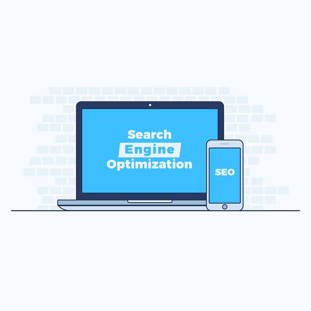
What is the role of mobile SEO in website optimisation?
Search engine optimisation (SEO) has evolved considerably over the past few years. It's main role is to improve a website's visibility in search engine results pages (SERPs), helping you attract organic and quality traffic to your website, turning website visitors into paying customers.
Originally desktop computers were the main devices used to access the internet. Today, smart phones have taken over. In fact, forty eight percent of Google searches are completed on a mobile device these days.
This user behaviour shift has resulted in mobile SEO becoming more important than ever before. Having a desktop friendly website is simply not enough any more, especially now that Google has announced mobile first indexing.
Mobile first indexing means Google will crawl and index your mobile website, even if you have a desktop site. It doesn't matter if users are searching on a desktop or mobile, Google uses the information crawled and indexed on your mobile version. This just shows you how important mobile SEO is today.
Mobile optimisation is a process where you adjust your website design, page structure, and layout to enable visitors across all devices to access and engage with your site. Mobile optimisation ensures your site looks good on any mobile device, ensuring it performs well.
It has become important because of the shift in user behaviour. More people are using mobile devices to search the internet and this trend is showing no signs of slowing down. This shows that mobile optimisation is not optional, it's a must. If you want to improve user experience, increase visibility, and drive quality and organic traffic to your website, your site needs to be optimised for mobile.
Mobile optimisation is more than simply meeting Google's requirements, it's about providing your users with a better experience. When your website is mobile friendly, it offers excellent benefits:
User experience is an important ranking factor. Mobile SEO contributes to user experience. When your website is mobile optimised it loads quickly with easy navigation, and can be easily read on any device or orientation. This makes your website a pleasant experience for users, keeping them on your website for longer.
When your website visitors find your site too difficult to navigate, or too slow to load on their mobile device, they will leave quickly, increasing your bounce rates. With effective mobile optimisation you can reduce your bounce rate, providing a great user experience. Search engines take bounce rates into consideration when determining your position in SERPs.
The longer a user spends on your website, the higher your dwell time will be. This is an indirect ranking factor. When you provide a seamless mobile experience, users spend more time exploring and engaging with your site, sending positive signals to search engines that your site offers relevant information.
Websites that are mobile optimised have a higher conversion rate. When users find the site easy to navigate with valuable content, they are more likely to take a desired action. Conversions are not a ranking factor, but it does measure how effective your website is, enabling you to identify if it is aligning with your goals.
What we do know, is in addition to providing a great user experience, a website that is mobile optimised is favoured by Google and other search engines, helping to improve your ranking in SERPs. If you want to reach your target audience and not miss out on valuable website visitors, you will want to ensure your site is optimised for mobile.

Genie Crawl carried out a detailed SEO audit for my tutoring website and explained everything in a clear and understandable way. I hired them straight away and since then I have seen a noticeable improvement in the traffic and leads coming to my website.

Awesome service, Tony and the team have been great with completing our website and meeting all the deadlines we set. They have lots of bright ideas and created so much value to our business. Our search engine rankings are now on the first page of the Google! We wouldn't have managed this without you guys!

Excellent service and great results with our Google Ads account. They are always there at the end of the phone when we need them and they are a friendly bunch of people to deal with. We are very happy with the results.

Genie Crawl has helped massively with my rankings as a business owner using SEO. My business is doing very well now, all thanks to them!

Genie Crawl is a very efficient company to work with; they were clear on what they felt they could offer and assisted me in improving my SEO rankings.

GenieCrawl was recommended to me for their SEO optimisation services and they have been great to work with. Our traffic jumped straight away and our business has gone from strength to strength thanks to their support.

I was really struggling to get my SEO ratings higher for my business, and my website noticed on google. Thanks to GenieCrawl and their excellent service and SEO knowledge, I was able to increase my rankings sufficiently and am now reaping the benefits of their optimizations. I would highly recommend their service if you are struggling with SEO rankings as I was.

As a new business start up we needed help driving traffic to our website. In all fairness this was an area we were all pretty clueless on. Genie Crawl have been invaluable to us and undoubtedly have been a driving force to increasing sales. They are always there with helpful advice when we need them. Thanks!

I was a little skeptical about hiring a company to help with the SEO for my website, but I am over the moon with my decision to work with Genie Crawl. They have really increased the traffic to my website and I would highly recommend them to everyone!

Fantastic company. They've been essential in getting us the business that we need. Would completely recommend. We've really found that our rankings have gone through the roof. SEO experts for sure! A+
Complete the form and a member of our team will be in touch shortly to discuss your enquiry.
© 2025 Genie Crawl. All Rights Reserved.


