We are rated as the Best SEO and Google Ads Agency of 2024. Check out our Google and Clutch reviews below.
 No fixed contract, just MONTH BY MONTH
Affordable and FAIR prices
Fast responses WITHIN hours
We love getting RESULTS
No fixed contract, just MONTH BY MONTH
Affordable and FAIR prices
Fast responses WITHIN hours
We love getting RESULTS


Why Having a Mobile-First Website is Critical for SEO
Mobile-first design is no longer an option in today's evolving digital landscape. With mobile traffic increasing, search engines have shifted to mobile-first indexing. This means that they use the mobile version of your website to index and rank your site. If you haven't optimised your website for mobile, you are being left behind, losing valuable website traffic.
The number of mobile devices worldwide were close to fifteen billion in 2021 and expected to surpass eighteen billion by 2025. Research shows that the smart phone market saw a ten percent increase in Q1, 2024, with close to three hundred million units sold. This growth is simply staggering and now more than half of internet traffic comes from mobile devices. As a result, users expect websites to be fast loading, simple to navigate, offering a pleasant experience across any device. If your site isn't optimised, you could be losing out on potential customers.
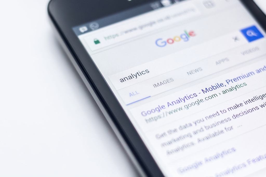
Google saw this shift in user behaviour and introduced mobile-first indexing. This means the Google algorithms use mobile versions of a website to determine how it should be ranked in search results. It's important to note that not only Google has implemented these changes, other search engines including Bing are also rewarding websites that are mobile friendly. If you want your SEO strategy to succeed, you need a mobile-first website.
Mobile-first indexing means Google uses the mobile version of your website as the main source of information for indexing and ranking. This prioritises websites that provide a mobile-friendly experience, which has a direct impact on your ranking. Even if a large percentage of your website visitors use desktop computers, your ranking is still determined by your mobile website performance.
When it comes to your mobile-friendly website, there are some key metrics you need to regularly monitor:
User experience (UX) is an important part of any successful SEO strategy and it's imperative your mobile-first website design improves user experience. This includes faster loading times, easy navigation, along with clear and concise content.
There are some essential components that directly impact your SEO performance when it comes to mobile-first design. The Genie Crawl team have put together some steps to help you implement them effectively:
We live in a mobile-driven world and mobile-first website design is imperative to achieve online success, as search engines prioritise user experience, fast loading pages, and easy navigation on any device. When you adopt a mobile-first approach, you can improve your ranking in search results, providing an enhanced user experience, improving your long-term growth. If your website isn't mobile-friendly, get in touch with Genie Crawl today.

Genie Crawl carried out a detailed SEO audit for my tutoring website and explained everything in a clear and understandable way. I hired them straight away and since then I have seen a noticeable improvement in the traffic and leads coming to my website.

Awesome service, Tony and the team have been great with completing our website and meeting all the deadlines we set. They have lots of bright ideas and created so much value to our business. Our search engine rankings are now on the first page of the Google! We wouldn't have managed this without you guys!

Excellent service and great results with our Google Ads account. They are always there at the end of the phone when we need them and they are a friendly bunch of people to deal with. We are very happy with the results.

Genie Crawl has helped massively with my rankings as a business owner using SEO. My business is doing very well now, all thanks to them!

Genie Crawl is a very efficient company to work with; they were clear on what they felt they could offer and assisted me in improving my SEO rankings.

GenieCrawl was recommended to me for their SEO optimisation services and they have been great to work with. Our traffic jumped straight away and our business has gone from strength to strength thanks to their support.

I was really struggling to get my SEO ratings higher for my business, and my website noticed on google. Thanks to GenieCrawl and their excellent service and SEO knowledge, I was able to increase my rankings sufficiently and am now reaping the benefits of their optimizations. I would highly recommend their service if you are struggling with SEO rankings as I was.

As a new business start up we needed help driving traffic to our website. In all fairness this was an area we were all pretty clueless on. Genie Crawl have been invaluable to us and undoubtedly have been a driving force to increasing sales. They are always there with helpful advice when we need them. Thanks!

I was a little skeptical about hiring a company to help with the SEO for my website, but I am over the moon with my decision to work with Genie Crawl. They have really increased the traffic to my website and I would highly recommend them to everyone!

Fantastic company. They've been essential in getting us the business that we need. Would completely recommend. We've really found that our rankings have gone through the roof. SEO experts for sure! A+
Complete the form and a member of our team will be in touch shortly to discuss your enquiry.
© 2025 Genie Crawl. All Rights Reserved.


