We are rated as the Best SEO and Google Ads Agency of 2024. Check out our Google and Clutch reviews below.


How to Use Data Visualisation to Enhance Your Content Strategy
Data visualisation is very useful for your SEO efforts, helping you enhance your content strategy. Businesses use data visualisation to evaluate goals, doing comparisons, and more, helping to absorb a lot of information quickly.
Studies conducted by neuroscientists at MIT found that the brain processes visual content thirty times faster than processing a word. Content that has compelling visual elements can also boost engagement by more than thirty five percent.
There are a number of ways to use data visualisation if you want to enhance your content strategy:
You can use client demographic information to create a buyer persona, helping you identify where your leads come from. You can use social analytics to determine how your website visitors find your business online, helping you amend your strategy accordingly as needed. Visualisation for customer analytics can be in the form of a graph or chart, making it easy to understand the insights provided.
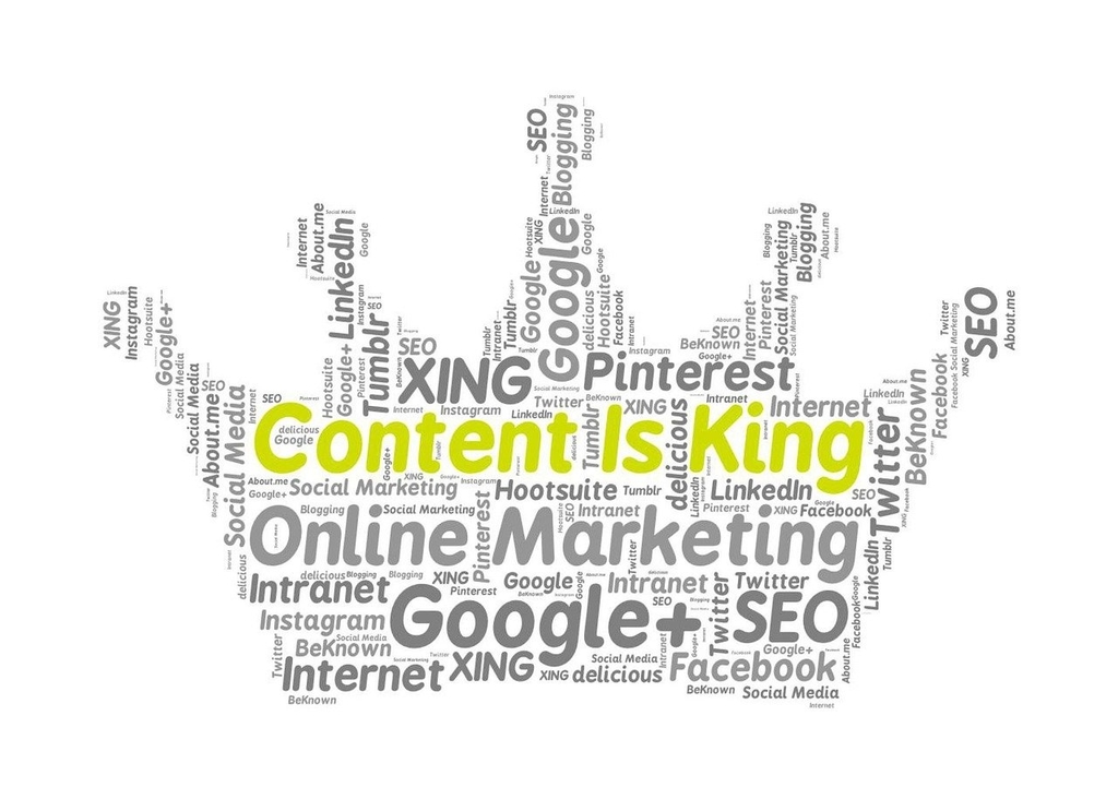
Data visualisation isn't only suitable in creating a buyer persona or identifying where your visitors come from, it is also highly effective when creating shareable content. Infographics and customised images are popular social media shares. You can take the latest figures or survey data and create an image or infographic, that will boost shareablilty, enhancing your reach.
Using visuals is an excellent way to ensure your website stands out. This is done by breaking up the text, and showing statistics or data that is current and fresh. As you would create an infographic, you can use data that is relevant to your industry, creating a visualisation that really stands out and grabs your visitors attention.
Using data to tell a story is an excellent way to grab your audiences attention and convert new leads. You can use in-house data, or you can use external data to support your content, making it valuable, high quality, and accurate.
There is a myriad of ways to incorporate data visualisation into your content strategy to boost engagement and increase dwell time. Visuals are easier for your audience to absorb, but you can also use data visualisation to understand your own website, where it is performing and where it is lacking. At Genie Crawl, we can help you turn your data into visualisations for your audience, or we can assist with data visualisation to understand your audience or what areas of your website needs improvement. Contact us today to find out more.

Genie Crawl carried out a detailed SEO audit for my tutoring website and explained everything in a clear and understandable way. I hired them straight away and since then I have seen a noticeable improvement in the traffic and leads coming to my website.

Awesome service, Tony and the team have been great with completing our website and meeting all the deadlines we set. They have lots of bright ideas and created so much value to our business. Our search engine rankings are now on the first page of the Google! We wouldn't have managed this without you guys!

Excellent service and great results with our Google Ads account. They are always there at the end of the phone when we need them and they are a friendly bunch of people to deal with. We are very happy with the results.

Genie Crawl has helped massively with my rankings as a business owner using SEO. My business is doing very well now, all thanks to them!

Genie Crawl is a very efficient company to work with; they were clear on what they felt they could offer and assisted me in improving my SEO rankings.

GenieCrawl was recommended to me for their SEO optimisation services and they have been great to work with. Our traffic jumped straight away and our business has gone from strength to strength thanks to their support.

I was really struggling to get my SEO ratings higher for my business, and my website noticed on google. Thanks to GenieCrawl and their excellent service and SEO knowledge, I was able to increase my rankings sufficiently and am now reaping the benefits of their optimizations. I would highly recommend their service if you are struggling with SEO rankings as I was.

As a new business start up we needed help driving traffic to our website. In all fairness this was an area we were all pretty clueless on. Genie Crawl have been invaluable to us and undoubtedly have been a driving force to increasing sales. They are always there with helpful advice when we need them. Thanks!

I was a little skeptical about hiring a company to help with the SEO for my website, but I am over the moon with my decision to work with Genie Crawl. They have really increased the traffic to my website and I would highly recommend them to everyone!

Fantastic company. They've been essential in getting us the business that we need. Would completely recommend. We've really found that our rankings have gone through the roof. SEO experts for sure! A+
Complete the form and a member of our team will be in touch shortly to discuss your enquiry.
© 2025 Genie Crawl. All Rights Reserved.


