We are rated as the Best SEO and Google Ads Agency of 2024. Check out our Google and Clutch reviews below.
 No fixed contract, just MONTH BY MONTH
Affordable and FAIR prices
Fast responses WITHIN hours
We love getting RESULTS
No fixed contract, just MONTH BY MONTH
Affordable and FAIR prices
Fast responses WITHIN hours
We love getting RESULTS


Optimising for Mobile: Essential Tips for Better Rankings
Mobile SEO is a process of optimising your website and content to provide a seamless and engaging user experience for visitors on mobile devices.
Optimising for mobile is essential in today's advanced digital landscape, where mobile traffic has surpassed desktop traffic across most industries. Smart phones have become an integral part of our daily lives with most people using their mobile devices when accessing the internet.
Google has emphasised the importance of mobile optimisation for a few years now and in 2015, they announced that mobile usability is now a major ranking factor. Optimising for mobile ensures your website is visible to your mobile audience, boosting user experience and search engine rankings.
Google announced Mobile-first indexing that means Google crawlers use the mobile version of your website to index and rank your site before your desktop site. This means having a responsive website is essential to improve your ranking in search engine results pages (SERPs).
There are some steps you can take to optimise your website for mobile focusing on better rankings:
A good user experience is imperative to your online success. Ensure your website is intuitive and provides easy navigation. Optimise the layout of content to improve readability on small screen sizes and avoid pop-ups where possible that can result in a negative user experience.
If you thought that a page loading time was important on a desktop computer, you can imagine how important it is on a mobile device with hardware and connectivity limitations. It is imperative that you minimise your images and code, avoid redirecting traffic and make use of browser caching to speed up your mobile site, helping to keep visitors engaged for longer.
Mobile devices change how websites are designed, which means most users prefer a simple website design. Adapt your design to align with mobile devices,using large fonts, and easy to click buttons, while content should be easy to read on small screens.
A responsive design is a great opportunity to reach your mobile and desktop users. These web designs automatically adjust based on the screen size and orientation of your website visitors device, ensuring a consistent user experience across any device.
When it comes to optimising for mobile, you want to ensure your users click through to your website. Be precise when creating meta descriptions, and URLs, using relevant keywords to boost visibility in search results.
If you offer local services then you should optimise your website for mobile without delay. When your mobile site is optimised for local searches, you reach your local audience that are searching for what you provide while on the move.
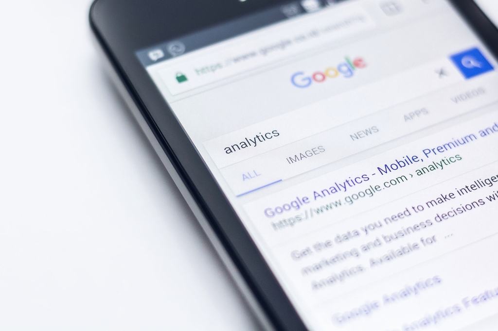
Google offers three tools that are very useful in analysing website performance on mobile devices. Google Search Console, PageSpeed Insights, and Lighthouse are easy and free to use. These tools provide real time information on the performance of your website, along with opportunities for improvement.
If your website is not optimised for mobile, you may be left behind your competitors. Mobile SEO has become essential to your brand visibility and ranking in SERPs. When you create a mobile optimised website using SEO best practices, you improve your visibility and gain more organic traffic. If you have any questions or you need help to optimise your website for mobile, get in touch with the Genie Crawl team today. We are here to help.

Genie Crawl carried out a detailed SEO audit for my tutoring website and explained everything in a clear and understandable way. I hired them straight away and since then I have seen a noticeable improvement in the traffic and leads coming to my website.

Awesome service, Tony and the team have been great with completing our website and meeting all the deadlines we set. They have lots of bright ideas and created so much value to our business. Our search engine rankings are now on the first page of the Google! We wouldn't have managed this without you guys!

Excellent service and great results with our Google Ads account. They are always there at the end of the phone when we need them and they are a friendly bunch of people to deal with. We are very happy with the results.

Genie Crawl has helped massively with my rankings as a business owner using SEO. My business is doing very well now, all thanks to them!

Genie Crawl is a very efficient company to work with; they were clear on what they felt they could offer and assisted me in improving my SEO rankings.

GenieCrawl was recommended to me for their SEO optimisation services and they have been great to work with. Our traffic jumped straight away and our business has gone from strength to strength thanks to their support.

I was really struggling to get my SEO ratings higher for my business, and my website noticed on google. Thanks to GenieCrawl and their excellent service and SEO knowledge, I was able to increase my rankings sufficiently and am now reaping the benefits of their optimizations. I would highly recommend their service if you are struggling with SEO rankings as I was.

As a new business start up we needed help driving traffic to our website. In all fairness this was an area we were all pretty clueless on. Genie Crawl have been invaluable to us and undoubtedly have been a driving force to increasing sales. They are always there with helpful advice when we need them. Thanks!

I was a little skeptical about hiring a company to help with the SEO for my website, but I am over the moon with my decision to work with Genie Crawl. They have really increased the traffic to my website and I would highly recommend them to everyone!

Fantastic company. They've been essential in getting us the business that we need. Would completely recommend. We've really found that our rankings have gone through the roof. SEO experts for sure! A+
Complete the form and a member of our team will be in touch shortly to discuss your enquiry.
© 2025 Genie Crawl. All Rights Reserved.


