We are rated as the Best SEO and Google Ads Agency of 2024. Check out our Google and Clutch reviews below.
 No fixed contract, just MONTH BY MONTH
Affordable and FAIR prices
Fast responses WITHIN hours
We love getting RESULTS
No fixed contract, just MONTH BY MONTH
Affordable and FAIR prices
Fast responses WITHIN hours
We love getting RESULTS


The Impact of Mobile-First Indexing on Your SEO Strategy
Mobile first indexing was first introduced in 2016 which involved crawling and indexing websites from a mobile perspective. By December 2018 half of the websites in Google search results were indexed through mobile first indexing. This means if you do not have a mobile friendly website, your SEO efforts could be negatively impacted.
Mobile-first indexing is a method used by search engines, including Google, to determine the ranking of your website in search engine results. Due to the fact that so many people are now using smart phones when searching online, Google pays closer attention to how your website is displayed on small mobile devices, meaning they prioritise the mobile version of your site when deciding how to rank it.
Traditionally, your desktop website version was indexed and ranking, but with the rise in mobile usage, search engines have shifted to crawling, indexing, and ranking the mobile version of your website. As a result, it's essential to incorporate mobile-first indexing strategies to your SEO campaign, as they directly impact your website visibility and ranking.
Creating a mobile-friendly website is essential to keep visitors on your website and boost conversions. There are numerous practices you can follow to ensure your mobile-friendly website is effective:
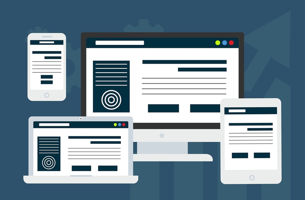
Responsive website design means you create the layout of your site that can adapt to different screen sizes and orientations. Users can interact with your website from any device and have a positive user experience (UX). Navigation is easier, while text becomes readable on even the smallest screen.
Web speed is essential to keeping your visitors on your website. If your pages don't load within a few short seconds, they will abandon your site. Google recommends websites should load within three seconds, though at Genie Crawl, we aim for two seconds or less. With a high abandon rate, your bounce rate increases, which can negatively impact your ranking in search engine results pages (SERPs).
Compressing your images can also be linked to your website speed. When you compress images you speed up your site, reducing the amount of data that needs to be loaded, while maintaining the high quality of the images.
Pop ups on any device are frustrating, but they are a serious negative on mobile devices, as they obscure important information, causing frustration for your website visitor, which could result in a higher bounce rate.
The navigational features of your website need to be changed for mobile. Button sizes should be smaller and clickable for users. They should be placed where they can be seen without covering important information.
Due to the fact that a mobile screen is considerably smaller than a desktop screen, the text also appears smaller. This means having to pay close attention to the font size, ensuring that it is large enough to read on a mobile device without having to zoom in. If your text is too small, your visitor may not be able to engage with the content or read the information they were looking for.
Mobile-first indexing should not be seen as a frustration. In fact, it is a great opportunity to create a mobile friendly website that resonates with your audience. Do you need help making your website mobile-friendly to align with Google's Mobile-First Indexing? Contact the Genie Crawl team now to find out more.

Genie Crawl carried out a detailed SEO audit for my tutoring website and explained everything in a clear and understandable way. I hired them straight away and since then I have seen a noticeable improvement in the traffic and leads coming to my website.

Awesome service, Tony and the team have been great with completing our website and meeting all the deadlines we set. They have lots of bright ideas and created so much value to our business. Our search engine rankings are now on the first page of the Google! We wouldn't have managed this without you guys!

Excellent service and great results with our Google Ads account. They are always there at the end of the phone when we need them and they are a friendly bunch of people to deal with. We are very happy with the results.

Genie Crawl has helped massively with my rankings as a business owner using SEO. My business is doing very well now, all thanks to them!

Genie Crawl is a very efficient company to work with; they were clear on what they felt they could offer and assisted me in improving my SEO rankings.

GenieCrawl was recommended to me for their SEO optimisation services and they have been great to work with. Our traffic jumped straight away and our business has gone from strength to strength thanks to their support.

I was really struggling to get my SEO ratings higher for my business, and my website noticed on google. Thanks to GenieCrawl and their excellent service and SEO knowledge, I was able to increase my rankings sufficiently and am now reaping the benefits of their optimizations. I would highly recommend their service if you are struggling with SEO rankings as I was.

As a new business start up we needed help driving traffic to our website. In all fairness this was an area we were all pretty clueless on. Genie Crawl have been invaluable to us and undoubtedly have been a driving force to increasing sales. They are always there with helpful advice when we need them. Thanks!

I was a little skeptical about hiring a company to help with the SEO for my website, but I am over the moon with my decision to work with Genie Crawl. They have really increased the traffic to my website and I would highly recommend them to everyone!

Fantastic company. They've been essential in getting us the business that we need. Would completely recommend. We've really found that our rankings have gone through the roof. SEO experts for sure! A+
Complete the form and a member of our team will be in touch shortly to discuss your enquiry.
© 2025 Genie Crawl. All Rights Reserved.


