We are rated as the Best SEO and Google Ads Agency of 2024. Check out our Google and Clutch reviews below.


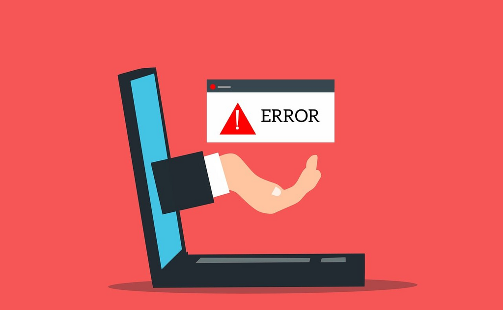
Why Error Messages are Critical to Good UX
Today's digital world focuses on user experience (UX) design, every element serves a purpose including your error messages. When an error occurs, and chances are they will, an effective error message provides guidance and clarity. It helps users understand and rectify the situation, it's not only about highlighting mistakes.
Error messages are essential to a user-friendly web design, as they:
Imagine your user filling out a form, encountering an error when they submit it. Without guidance on what went wrong and how to fix it, your user will become frustrated. An effective error message alleviates frustration, providing users with a clear path.
When your error messages are intuitive and supportive, they turn a moment of confusion into a positive experience, demonstrating that you care about your users needs and are committed to helping them.
When a user is faced with an unclear error message, chances are they will abandon what they were doing. When you provide a clear and actionable error message, they are more encouraged to correct the mistake and proceed.
Your error messages should provide clear and empathetic communication to your user, acknowledging the error happened and providing a resolution.
In order to create effective error messages to improve UX, you should focus on the following key elements:
Clarity is essential when it comes to an effective error message. It's important your users immediately understand what went wrong and why. Do not use technical language or jargon, keep the message concise and clear.
Your error messages should be placed near the problematic field, eliminating the need for your users to guess where they went wrong. Provide them with context, such as a valid input or expected format.
Identifying an error is not enough when it comes to UX, you need to provide your users with actionable guidance, steps and suggestions that help them resolve the issue.
Error messages can be frustrating for users on your website. Ensure you use polite language, conveying you understand and support them.
Using icons, colours or distinct styles can draw your users attention to errors. Never make colour your only indicator, ensuring your site remains accessible for users with colour blindness.
Error messages are vital when it comes to good UX, reducing user frustrating and improving user experience. It's important to focus on creating effective, polite, and actionable error messages that provide users with a seamless journey and a positive experience when using your site. Do you need help with UX design or error message design? Genie Crawl are here to assist. Contact us today to find out more.

Genie Crawl carried out a detailed SEO audit for my tutoring website and explained everything in a clear and understandable way. I hired them straight away and since then I have seen a noticeable improvement in the traffic and leads coming to my website.

Awesome service, Tony and the team have been great with completing our website and meeting all the deadlines we set. They have lots of bright ideas and created so much value to our business. Our search engine rankings are now on the first page of the Google! We wouldn't have managed this without you guys!

Excellent service and great results with our Google Ads account. They are always there at the end of the phone when we need them and they are a friendly bunch of people to deal with. We are very happy with the results.

Genie Crawl has helped massively with my rankings as a business owner using SEO. My business is doing very well now, all thanks to them!

Genie Crawl is a very efficient company to work with; they were clear on what they felt they could offer and assisted me in improving my SEO rankings.

GenieCrawl was recommended to me for their SEO optimisation services and they have been great to work with. Our traffic jumped straight away and our business has gone from strength to strength thanks to their support.

I was really struggling to get my SEO ratings higher for my business, and my website noticed on google. Thanks to GenieCrawl and their excellent service and SEO knowledge, I was able to increase my rankings sufficiently and am now reaping the benefits of their optimizations. I would highly recommend their service if you are struggling with SEO rankings as I was.

As a new business start up we needed help driving traffic to our website. In all fairness this was an area we were all pretty clueless on. Genie Crawl have been invaluable to us and undoubtedly have been a driving force to increasing sales. They are always there with helpful advice when we need them. Thanks!

I was a little skeptical about hiring a company to help with the SEO for my website, but I am over the moon with my decision to work with Genie Crawl. They have really increased the traffic to my website and I would highly recommend them to everyone!

Fantastic company. They've been essential in getting us the business that we need. Would completely recommend. We've really found that our rankings have gone through the roof. SEO experts for sure! A+
Complete the form and a member of our team will be in touch shortly to discuss your enquiry.
© 2025 Genie Crawl. All Rights Reserved.


